


about
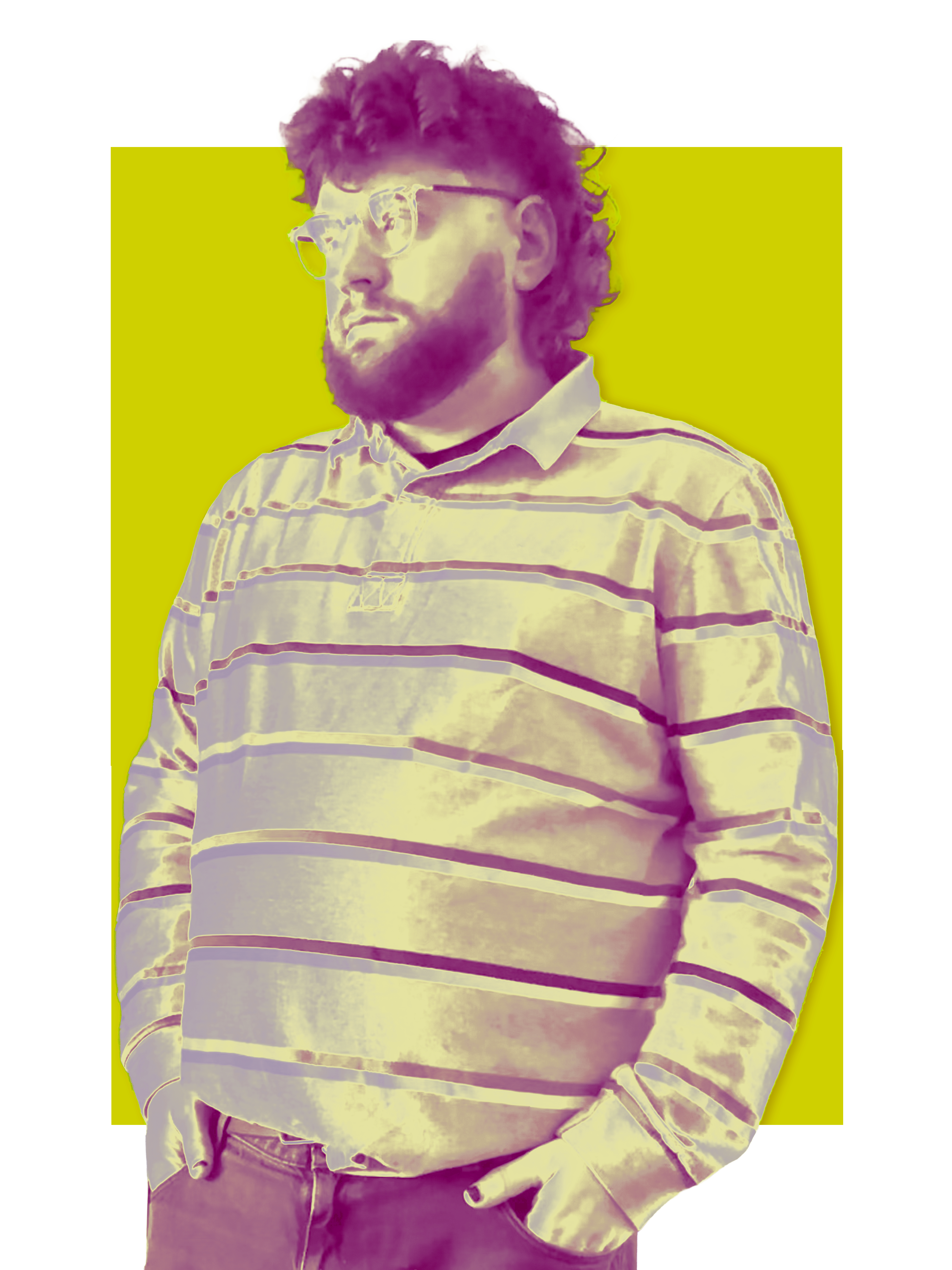
Alright! My name is Bobby Hardy.As a creative, I work in print, graphics, video, digital design (UX/UI), and branding.I'm particularly interested in how effective design can subtly enhance the user experience without drawing attention to itself. My life has essentially always been design, and I'm in a constant state of inspiration, creation, and inspiration again.When I deal with customers, I don't regard myself as merely a hired designer. I see myself as a member of your team, working together to realise your vision and achieve your objectives.
Take a look through my portfolio, and if you are intrested in working togther, please find my details in contact.